
The Postify brand, in one place.
Logos, palette, type, and how to use them. Everything below is free to use for press, partners, and integrations — please follow the usage rules.
Logos
The green speech-bubble wordmark is the primary brand asset. The icon-only mark is reserved for tight spaces — favicons, app icons, social avatars. Keep at least one cap-height of clear space around any lockup.
Palette
One lime accent against a near-black canvas and a neutral grey scale. The lime is intentional — it should be the most-emphasised colour on any given screen. The brand green is reserved for the logo mark.
#D6FD70hsl(77 95% 72%)--primary / --accent-warmThe accent. CTAs, focus rings, eyebrow rules, key numerals. The most-emphasised colour on any screen.
#00D756hsl(146 100% 42%)logo markThe speech-bubble logo mark only. Not used as a UI fill.
#131313hsl(0 0% 7.5%)--primary-foregroundText and icons set on lime surfaces (e.g. inside CTA buttons).
#000000hsl(0 0% 0%)--backgroundThe default canvas. Pure black in the dark theme.
#FAFAFAhsl(0 0% 98%)--foregroundPrimary body text on dark surfaces.
#1C1C1Chsl(0 0% 11%)--cardElevated surfaces — panels, cards, popovers.
#BFBFBFhsl(0 0% 75%)--muted-foregroundSecondary copy, captions, labels. Clears WCAG AA on black.
#2E2E2Ehsl(0 0% 18%)--borderCard frames, dividers, input outlines.
Typography
Plus Jakarta Sans across the entire UI — semibold for display, regular for body, with tracking that tightens as size grows. Geist Mono carries labels, code, and eyebrows. Caveat is the editorial script accent, reserved for handwritten emphasis (max ~3 words at a time).
Postify learns your brand once — voice, audience, references — then drafts and publishes a full week of content for you. You review, hit Publish.
Mascot
Meet Posti — the Postify chameleon. Posti adapts to any brand, the way Postify adapts your content to any platform. Use the official renders only; don't recolour, redraw, or generate new poses.
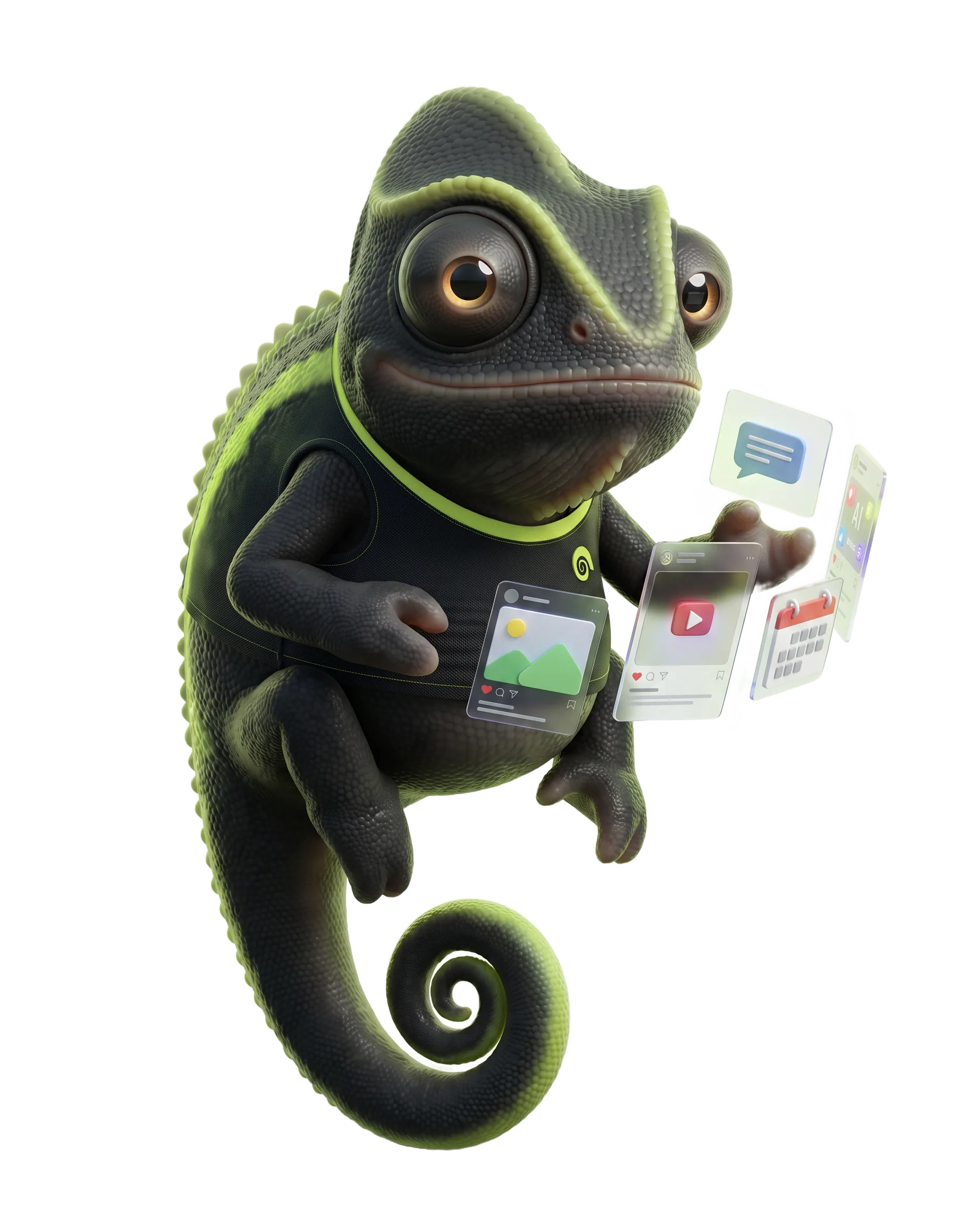
- Always wears the lime "p" tee.
- Keep generous clear space; let Posti breathe.
- Pair with the lime glow on dark backgrounds.
Usage rules
- Use the wordmark over a solid colour with clear space around it.
- Lead with the lime accent — let it be the single loudest colour on screen.
- Keep the icon mark square at minimum 24×24 px.
- Use Caveat sparingly — a single 1–3 word accent per screen.
- Rotate, stretch, or skew the wordmark.
- Apply gradients, drop shadows, or outlines to the logo.
- Recolour the logo or Posti outside this palette without written permission.
- Place the wordmark on busy or low-contrast imagery.
Downloads
Grab individual assets below. For a zipped press kit or extended brand questions, email [email protected].